THE MITTEN (A long, sad saga)
Years ago I was commissioned to produce a new version of the classic tale ‘The Mitten’ and I thought I should write about it here as it shows how projects can go awry despite our best efforts. This is work I’m really proud of and a book I really believe in despite the fact that it is sitting in a drawer of my plan-chest awaiting a miracle.

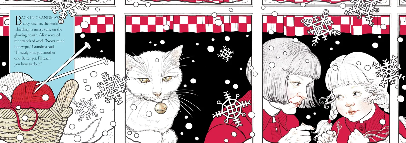
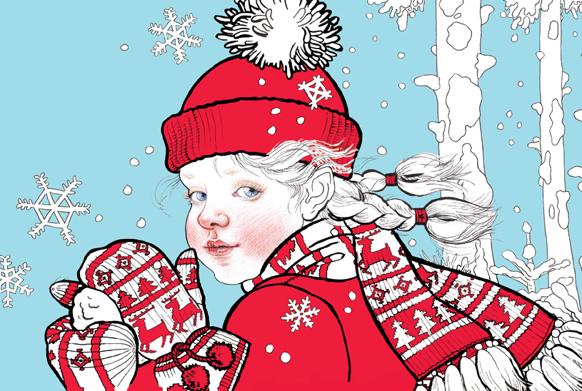
When I was asked to come up with my own version of what is a well known story, (and with a long-standing best-selling edition by Jan Brett already on the market), I decided I needed to explore a totally new way of working (pointless to put another highly-worked version in direct competition). I have mentioned before that a couple of art directors thought my work ‘too serious’ for younger readers and this was an ideal opportunity to try and address that so I set out to produce something simple and bright. Knowing my tendency to just keep on adding detail I picked up some felt-pens, (usually dismissed as a child’s medium), which meant making bolder, freer marks. Because the story is set in the snow I chose a very limited colour palette—red and black on white—which would very definitely set it apart from Jan Brett’s.

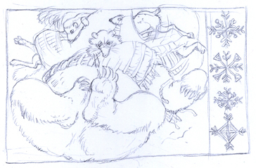
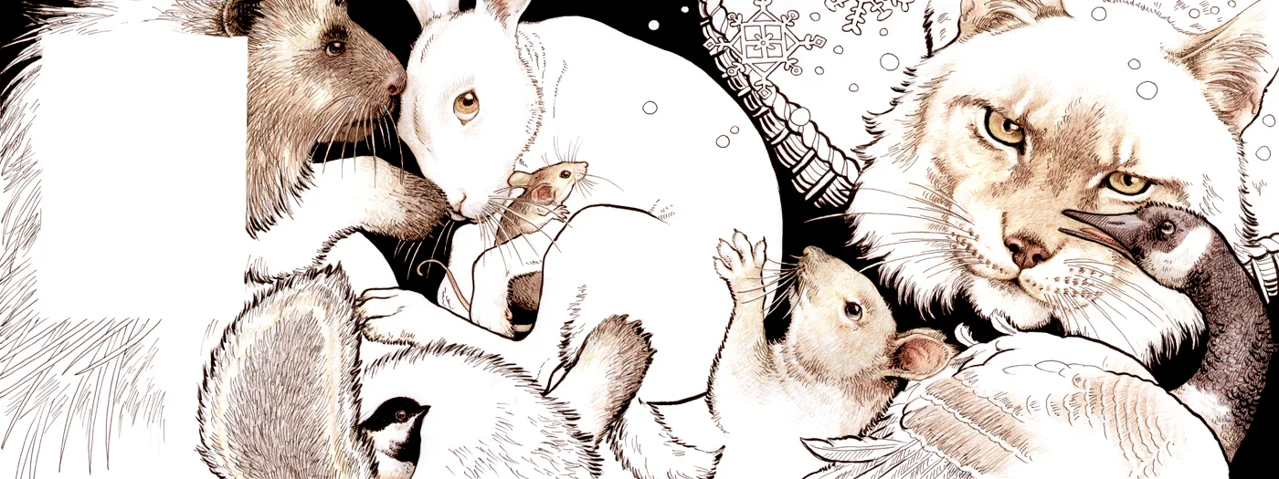
The opportunity to draw the stars of the story—the animals—was such a rare pleasure for me and I intentionally worked quickly so as not to become ‘too precious’ about the marks I was making, relishing the spontaneity and freedom the felt pens gave me, adding a little coloured pencil here and there (can’t resist those details!).


The initial reaction to the drawings was very favourable and I congratulated myself on discovering a new method that could potentially open up my work to a wider market, something I strive for all the time. However (and I have found this often happens to work I am particularly pleased with and which is particularly difficult to deal with) the more people who saw it and the nearer it came to being published, the more the lack of colour became a problem. I don’t know about you, but I am always drawn to work with a restricted palette or even no colour at all, as it stands out against its surroundings and yet I often suspect that the industry is heavily prejudiced against such pieces. On what grounds? Children only like lots of bright colour? I don’t think so. Buyers are only attracted to lots of bright colours? Again, I don’t think so. Anyway, I was asked to add more colour, which I was really loathe to do, but eventually decided that by adding one more strong colour I could give the impression of more colourful pages. I thought a particular blue when added to the red would look somewhat Scandinavian and therefore still ‘wintery’.


I was eventually reconciled to the changes and still excited to see the book in print but sadly there were more snags as time went on. The ultimate client was a large US book buying chain (Border’s) that was undergoing financial difficulties and as a result were changing staff at an alarming rate, and at each change of guard ‘The Mitten’ became entangled in more and more political upheaval. In the end the company went bust and ‘The Mitten’ was left high and dry.
Several years went by and several successful books; Dracula, Robin Hood, Snow White etc. but I couldn’t give up on ‘The Mitten’. The rights to the illustration were eventually returned to me, which meant rewriting the text so that I had full copyright control—it is a very simple story based on a Ukrainian Folk Tale so it wasn’t too difficult to do.
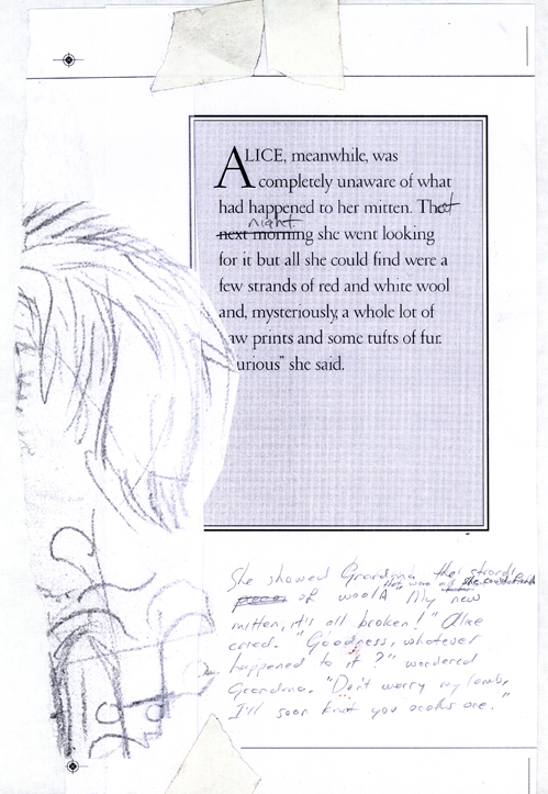


Looking at it afresh, and changing the story a little, still meant redrawing some of the spreads though it retained its ‘North American’ and contemporary setting. And this is where it stands now. I still believe wholeheartedly in this book but how to get it published? Perhaps this is where I take the plunge and self-publish? I don’t think there’s much point in digital publishing as such as how to make it stand out amongst the many thousands? I think it has a possible future as an interactive App; I have explored the possibility of commissioning an animator and getting my good friend Christopher Aslan to be the narrator and think it may be worth the investment. The simplicity of the story and illustrations lends itself to quite limited animation that would add an interactive element, so ‘value-adding’ which is always an asset.

This would be a totally new departure for me and I do believe it is something all illustrators should be exploring if only to release us from the ever-tightening strictures of mainstream publishing—I only wish I was young enough to learn to animate for myself! Take heed all you young illustrators—learn how to animate! Alternatively I have been looking at very small-edition publishing where a ‘hand-made’ element is usually added. My initial sketch had a mitten-shaped embroidered book-bag that would be feasible in very small numbers, or I could look into a hand-bound hand-printed version. Back at the beginning of the project I had a friend, Sue Taylor, draft a pattern for the mitten in my illustrations and knit it for me—it struck me that with a resurgence of interest in knitting it might be something ‘Granny’ might like to do and so ‘value-add’.


So that is where it stands. I’ve given it a new title and it’s now called ‘One Snowy Night’ just in case that removes the jinx that’s been hanging over it. Should I ever have enough funds to hire that animator I think I would like to explore the App option. Fingers crossed.