Rashomon
As this is my first ever blog posting I wondered what on earth I should write about ------do I have anything interesting to say? Then I thought about my experience as an illustrator for 35+years and decided to just write about that. What I am working on, how I did it, and what my thought processes were. So here’s my first post----it’s a new book that I am very proud of, for Grimm Press in Taiwan----a new version of ‘Rashomon’.
Initially made famous by Akira Kurosawa’s 1950 film based on two stories by Ryunosuke Akutagawa (‘Rashomon’ and ‘In a Grove’), it is has a plot device that uses various characters to recount different versions of a violent event. It has a rape, a murder, a ghost and plenty of dead bodies------a little different from the fairies, princesses and knights I am often asked to illustrate!
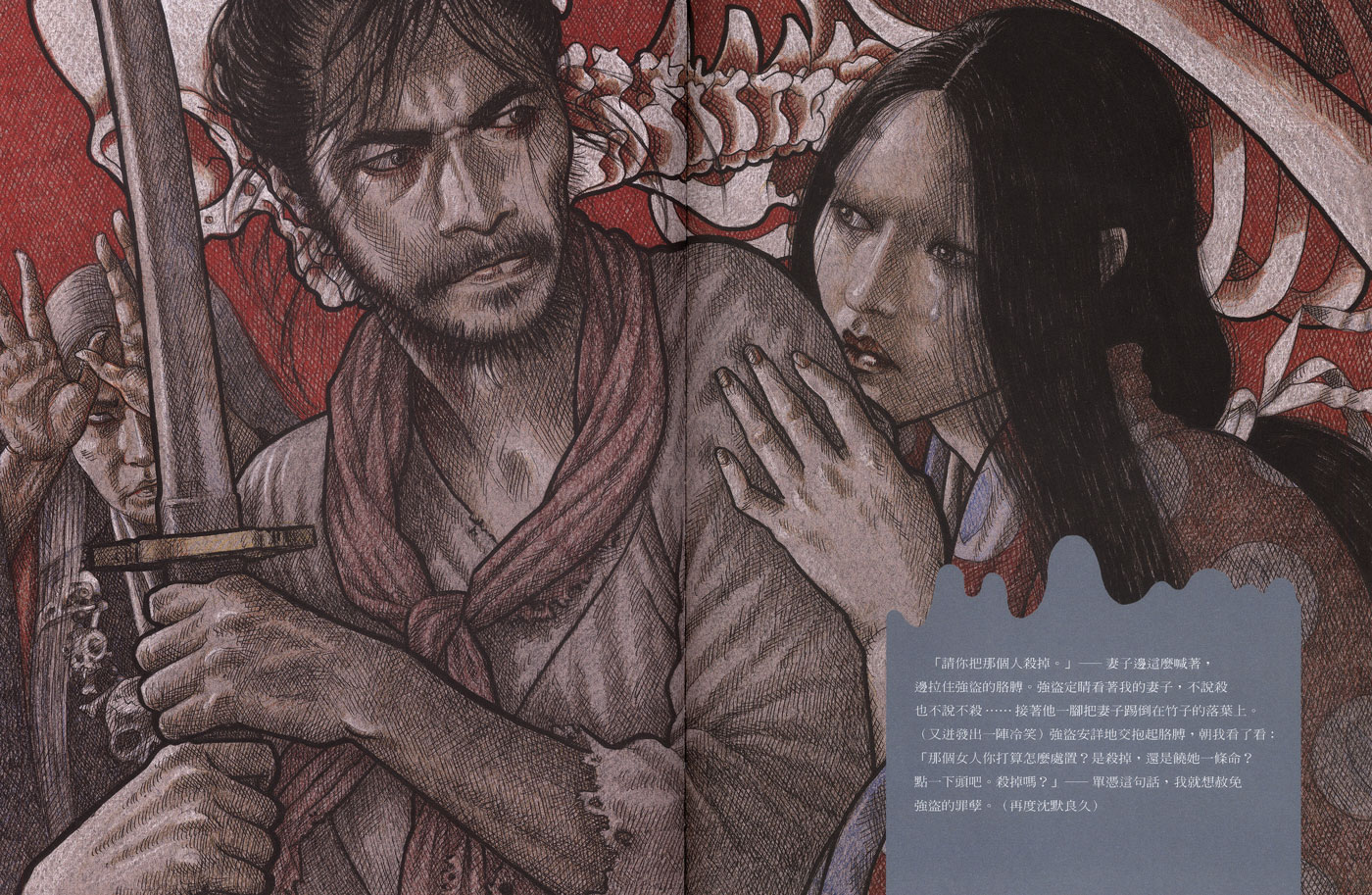
I was very excited to be offered this commission, not only by the setting of ancient Japan, but also by the dramatic story-line that allowed me to explore a different side to my work. (As I usually work with coloured pencils I am often typecast as an illustrator of softer, more romantic subjects; something I have always fought against.) I have been fascinated by Japanese prints since my youth and decided to approach ‘Rashomon’ with these in mind knowing their strong colours and graphic nature would be well suited to the gruesome subject matter. (I particularly liked Kuniyoshi’s skeletons and used a version of these as my ghost.)
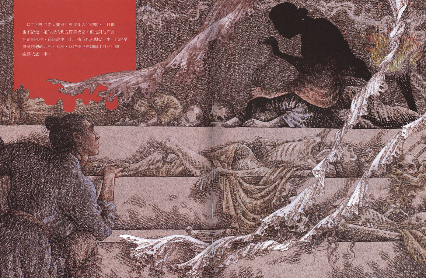
Also, when it came to where to put the type I noticed that a lot of the Japanese printmakers would add a scroll or banner on top of the image to contain the written information and so I decided to employ this device.
Researching the actual ‘Rashomon’ gate (which was an old city gate of Kyoto fallen into ruin) was quite challenging as there is very little evidence of what it looked like therefore I kept mine pretty vague and atmospheric, giving a shadowy impression of pillars and falling timbers. At the start of Grimm’s version a young man shelters in the ruin during a storm and comes across an old crone kneeling in the dark, plucking the hairs from a corpse----the building being used as a dumping ground for the city’s dead.
To achieve a more graphic appearance to the spreads I chose not to photograph real people as I usually would, but based my figures loosely on film stills and my imagination, drawing them in a fairly free manner using bold lines and colour. It did make me very nervous being so experimental-----the only other book that I have attempted to work on without taking my own reference pictures was ‘Dracula’ (for Templar Publishing). Having so little to work from did liberate my drawing from too much fuss and forced me to make bigger, bolder strokes rather than get hung up on finer details.
Recently I have begun varying my techniques more and more and found that I can work more freely and make bolder marks by using thick Canson papers and working with marker pens on top of coloured pencil. Forcing myself to use thick black lines has changed my style and allowed me tremendous freedom. I would never advise an illustrator to use an experimental style on an actual commission but the older I get the more I find it rewarding to take these risks. At the age of 62 I think I am just coming into my creativity!


