DRACULA (Templar Publishing ISBN 978-1-84011-571-0)
I had wanted for years to illustrate Dracula-----however, type-caste by my use of coloured pencils to draw endless princesses and dragons, no one would look at me when it came to ‘darker’ subject matter. Imagine my joy when Mike Jolley at Templar rang me to ask whether or not I’d be interested!
For me Dracula is a love story, not so much a vicious creature of the night, more a tormented loner looking for love the only way he knew how. He was always going to be the Byronic anti-hero of my book rather than the depraved monster of legend. I had tackled similar subject matter before which had mostly gone unnoticed----years ago a friend posed for a vampire from the middle-east which appeared in Time-Life Books, and more recently I had produced a sample-piece based on ‘The Bride of Frankenstein’. I will be forever grateful to Mike Jolley who showed great faith in my abilities, previously untried, by offering me this book.
When I am offered a new book I always take it upon myself to produce a sample in which I explore the nuances of mood and colour and where I decide on the overall style. The drawback to coloured pencils (one of many, that is) is the inability to make strong dark colours---particularly black, so my first thought was to use acrylics. I have always said I am a drawer rather than a painter so it wasn’t an easy decision. I produced the sample below concentrating on the atmosphere of repressed eroticism and the idea of forbidden love----she is wrapped in her grave clothes but it is unclear whether she is dead or undead, but passive in the manner of Victorian womanhood.
The painting was greeted with general approval but the Templar crew wanted to explore alternate approaches before committing themselves so I took the same image and translated it into pencil. It was far too pallid so I went over it with a drawing pen, which added strength and (added benefit) gave almost the appearance of an old etching. This style seemed to fit the narrative and gave me the opportunity to add more detail so I decided to explore it further.
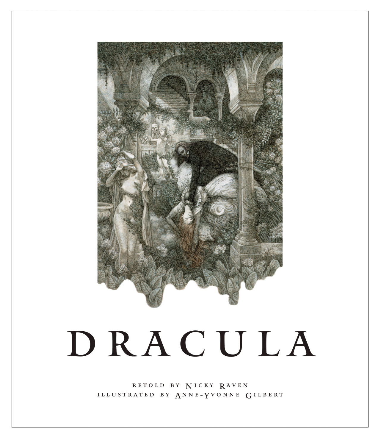
The true test of whether the pen and ink were the most suitable medium was to pull back from the figures and illustrate more of the setting. I wanted the background to the illustrations to be very lush and Gothic to emphasize both the ‘romantic’ aspects of the tale and the busily ornate Victorian era in which it is set, so I placed Dracula in an Italianate night garden amongst marble statues and trailing foliage. (At this point Dracula had long black hair as I had not received Nicky Raven’s manuscript.)
When we received the script (at this point it was decided that my husband, graphic designer Danny Nanos, would design the book) the first thing we noted was that Dracula was described as having long white hair and violet eyes------perfect, as we had already discussed avoiding wherever possible the usual red and black associated with the book! I started sketching immediately------I wanted to make him lean and hungry looking yet still attractive in an unconventional manner. (I have attached some of those initial sketches below.) I also chose not to use real people for reference as A.) I couldn’t find anyone who looked the way I imagined him and B.) I thought it would restrict the freedom I had to imagine the scenes.
This was the second time Danny and I had been commissioned to work on a book together and it made the experience one of mutual creativity and inspiration. We have a similar sense of aesthetics, both like to pare things to their essential elements; both are interested in exploring new ways to work. Danny’s love for typography informs all his work---he is inclined towards the spare and elegant emphasized by his use of white space. Working in the studio side-by-side enabled us to create the spreads together, passing them backwards and forwards, adding and subtracting in a way that would be normally impossible between an illustrator and a designer working in the usual way.
Together we created a visual language that became the voice of the project. Analyzing the essentials of the story the three main themes are love, death and fear and we felt we should not draw back from depicting any of these----however, to our disappointment, many of our original ideas were either deleted or watered down in deference to the younger readers. (I have attached some of our deleted spreads below). I still wonder why this type of censorship is necessary; though living in a far more repressed society than we inhabit the Victorians still felt free to depict nudity, religion and violence in even their children’s books. Have a look at Rackham and Dulac and Heath Robinson.
Even once the book was planned many of the spreads continued to evolve
as we worked on them. We both like to employ nuances and subtleties, for
instance, the wind blowing the type or lightening striking through it.
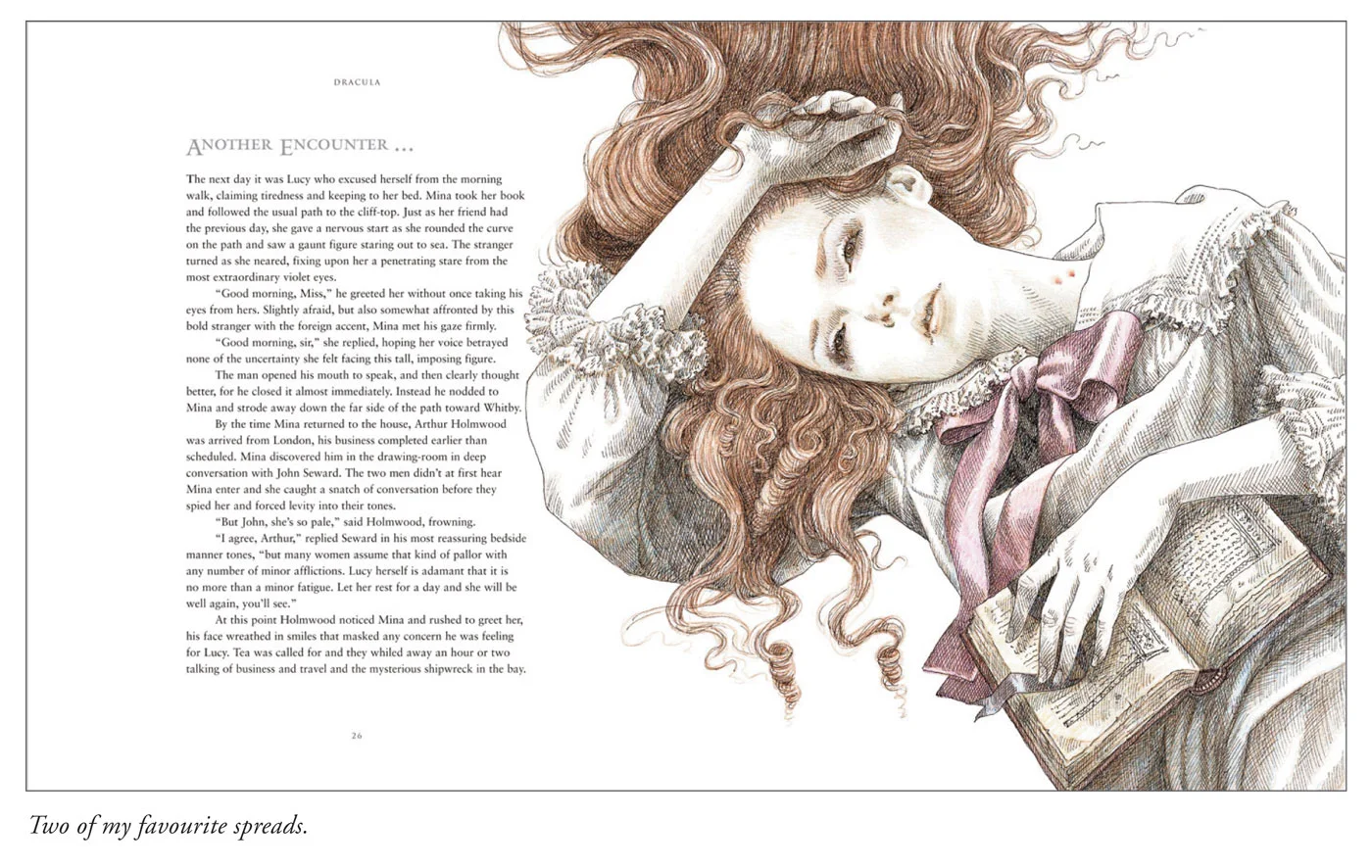
After scanning-in the illustrations and laying the type one or other of us would often suggest adding another layer to either the foreground or the background, adjusting the illustrations and text accordingly. A style unique to this project evolved as we worked----the directness of the design had a traditional quality to it whereas the simplicity of the drawings had a fresher, more contemporary feel to them and the two combined succeeded in interpreting Dracula in a completely new way. I enjoyed the whole project immensely and discovered a new freedom to illustrate which was deeply satisfying. Working together we felt able to try anything new that occurred to us, our only constraint being the ultimate deadline. Another point---although I do all my illustration the old-fashioned way with paper and pencils I discovered that computers are marvelous tools, for instance we were able to ‘ghost’ images with great subtlety, adding interesting layers to the pages quickly and efficiently.
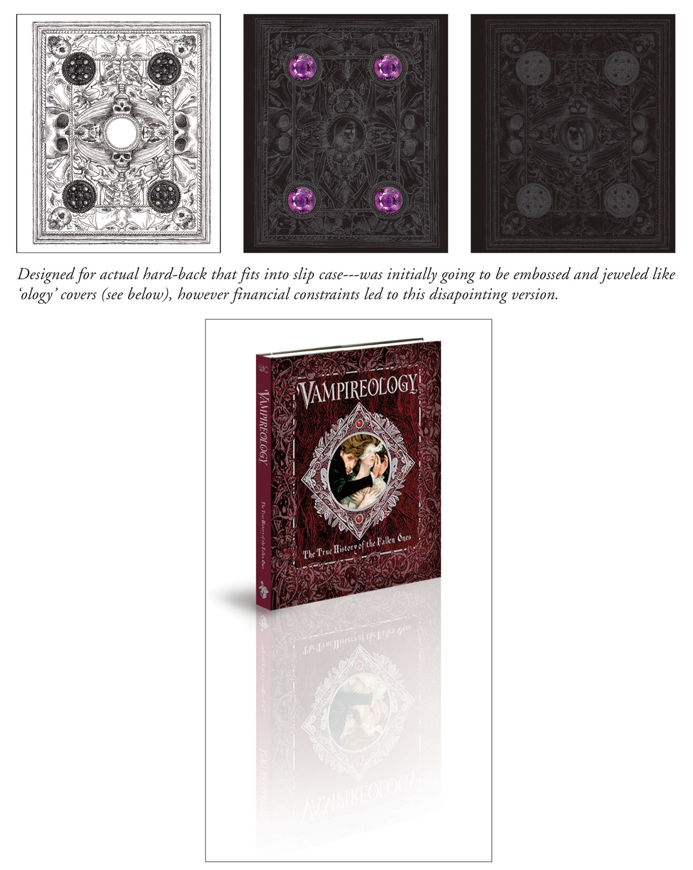
I feel I should talk more about the cover. Neither Danny nor I thought the cover should have the colour red anywhere near it. The colour of Dracula’s hair and eyes, according to Nicky Raven, informed the whole book and we therefore felt the cover should stick to the same tones. There was to be a slipcover bearing illustration and type and the book itself was to have an embossed hardcover studded with purple jewels like the famous ‘ology’ books. We presented many designs for the slipcover and a detailed drawing for the embossing. Disappointingly the embossing and jewels fell by the wayside and all that remains is a subtle hint of what it could have been.
And the cover became a bone of contention as it was reported to us that the booksellers insisted that all Draculas had to be red, this obeying some kind of law, and that our designs must be altered accordingly. We were very disappointed by this and tried to make the red as UN-red as we possibly could but still wish we could have changed it.
Danny decided to use the original sample of Dracula in the garden for the frontispiece with a bit of digital manipulation to alter the black hair (not to mention the nudity of the statues!).
My one great regret with this book is that they never made it into an app. It cries out for an eerie soundtrack and some subtle animation, it would work superbly! Who knows----they might change their minds.


